How to Represent Continuous Values in Programming
Introduction
Let's come straight to the point on this one – there are only 2 types of variables you see – Continuous and Discrete. Further, discrete variables can divided into Nominal (categorical) and Ordinal. We did a post on how to handle categorical variables last week, so you would expect a similar post on continuous variable. Yes, you are right – In this article, we will explain all possible ways for a beginner to handle continuous variables while doing machine learning or statistical modeling.
But, before we actually start, first things first.

What are Continuous Variables?
Simply put, if a variable can take any value between its minimum and maximum value, then it is called a continuous variable. By nature, a lot of things we deal with fall in this category: age, weight, height being some of them.
Just to make sure the difference is clear, let me ask you to classify whether a variable is continuous or categorical:
- Gender of a person
- Number of siblings of a Person
- Time on which a laptop runs on battery
Please write your answers in comments below.
How to handle Continuous Variables?
While continuous variables are easy to relate to – that is how nature is in some ways. They are usually more difficult from predictive modeling point of view. Why do I say so? It is because the possible number of ways in which they can be handled.
For example, if I ask you to analyze sports penetration by gender, it is an easy exercise. You can look at percentage of males and females playing sports and see if there is any difference. Now, what if I ask you to analyze sports penetration by age? How many possible ways can you think to analyze this – by creating bins / intervals, plotting, transforming and the list goes on!
Hence, handling continuous variable in usually a more informed and difficult choice. Hence, this article should be extremely useful to beginners.
Methods to deal with Continuous Variables
Binning The Variable:
Binning refers to dividing a list of continuous variables into groups. It is done to discover set of patterns in continuous variables, which are difficult to analyze otherwise. Also, bins are easy to analyze and interpret. But, it also leads to loss of information and loss of power. Once the bins are created, the information gets compressed into groups which later affects the final model. Hence, it is advisable to create small bins initially.
This would help in minimal loss of information and produces better results. However, I've encountered cases where small bins doesn't prove to be helpful. In such cases, you must decide for bin size according to your hypothesis.We should consider distribution of data prior to deciding bin size.
For example: Let's take up the inbuilt data set state.x77 in R to create bins:
#load data data <- data.frame(state.x77)
#check data head(data)
#plot Frost variable and check the data points are all over qplot(y = Frost, data = data, colour = 'blue')
#use cut() to create bins of equal sizes bins <- cut(data$Frost, 3, include.lowest = TRUE) bins
#add labels to bins bins <- cut(data$Frost, 3, include.lowest = TRUE, labels = c('Low','Medium','High')) bins Normalization:
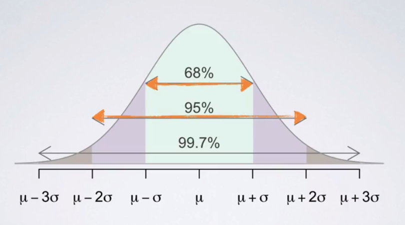
In simpler words, it is a process of comparing variables at a 'neutral' or 'standard' scale. It helps to obtain same range of values. Normally distributed data is easy to read and interpret. As shown below, in a normally distributed data, 99.7% of the observations lie within 3 standard deviations from the mean. Also, the mean is zero and standard deviation is one. Normalization technique is commonly used in algorithms such as k-means, clustering etc.
A commonly used normalization method is z-scores. Z score of an observation is the number of standard deviations it falls above or below the mean. It's formula is shown below.
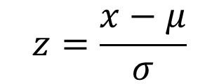
x = observation, μ = mean (population), σ = standard deviation (population)
For example: Randy scored 76 in maths test. Katie score 86 in science test. Maths test has (mean = 70, sd = 2). Science test has (mean = 80, sd = 3). Who scored better? You can't say Katie is better since her score is much higher than mean. Since, both values are at different scales, we'll normalize these value at z scale and evaluate their performance.
z(Randy) = (76 – 70)/2 = 3
z(Katie) = (86 – 80)/3 = 2
Interpretation: Hence, we infer than Randy scored better than Katie. Because, his score is 3 standard deviations away from the class mean whereas Katie's score is just 2 standard deviations away from mean.
Transformations for Skewed Distribution:
Transformation is required when we encounter highly skewed data. It is suggested not to work on skewed data in its raw form. Because, it reduces the impact of low frequency values which could be equally significant. At times, skewness is influenced by presence of outliers. Hence, we need to be careful while using this approach. The technique to deal with outliers is explained in next sections.
There are various types of transformation methods. Some are Log, sqrt, exp, Box-cox, power etc. The commonly used method is Log Transformation. Let's understand this using an example.
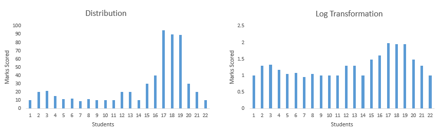
For example: I've score of 22 students. I plot their scores and find out that distribution is left skewed. To reduce skewness, I take log transformation (shown below). As you can see after transformation, the data is no longer skewed and is ready for further treatment.
Use of Business Logic:
Business Logic adds precision to output of a model. Data alone can't suggest you patterns which understanding its business can. Hence, in companies, data scientists often prefer to spend time with clients and understand their business and market. This not only helps them to make an informed decision. But, also enables them to think outside the data. Once you start thinking, you are no longer confined within data.
For example: You work on a data set from Airlines Industry. You must find out the trends, behavior and other parameters prior to data modeling.
New Features:
Once you have got the business logic, you are ready to make smart moves. Many a times, data scientists confine themselves within the data provided. They fail to think differently. They fail to analyze the hidden patterns in data and create new variables. But, you must practice this move. You wouldn't be able to create new features, unless you've explored the data to depths. This method helps us to add more relevant information to our final model. Hence, we obtain increase in accuracy.
For example: I have a data set where you've following variables: Age, Sex, Height, Weight, Area, Blood Group, Date of Birth. Here we can make use of our domain knowledge. We know that (Height*Weight) can give us BMI Index. Hence, we'll create HW = (Height*Weight) as a new variable. HW is nothing but BMI (Body Mass Index). Similarly, you can think of new variables in your data set.
Treating Outliers:
Data are prone to outliers. Outlier is an abnormal value which stands apart from rest of data points. It can happen due to various reasons. Most common reason include challenges arising in data collection methods. Sometime the respondents deliberately provide incorrect answers; or the values are actually real. Then, how do we decide? You can any of these methods:
- Create a box plot. You'll get Q1, Q2 and Q3. (data points > Q3 + 1.5IQR) and (data points < Q1 – 1.5IQR) will be considered as outliers. IQR is Interquartile Range. IQR = Q3-Q1
- Considering the scope of analysis, you can remove the top 1% and bottom 1% of values. However, this would result in loss of information. Hence, you must be check impact of these values on dependent variable.
Treating outliers is a tricky situation – one where you need to combine business understanding and understanding of data. For example, if you are dealing with age of people and you see a value age = 200 (in years), the error is most likely happening because the data was collected incorrectly, or the person has entered age in months. Depending on what you think is likely, you would either remove (in case one) or replace by 200/12 years.
Principal Component Analysis:
Sometime data set has too many variables. May be, 100, 200 variables or even more. In such cases, you can't build a model on all variables. Reason being, 1) It would be time consuming. 2) It might have lots of noise 3) A lot of variables will tell similar information
Hence, to avoid such situation we use PCA a.k.a Principal Component Analysis. It is nothing but, finding out few 'principal' variables which explain significant amount of variation in dependent variable. Using this technique, a large number of variables are reduced to few significant variables. This technique helps to reduce noise, redundancy and enables quick computations.
In PCA, components are represented by PC1 or Comp 1, PC2 or Comp 2.. and so on. Here, PC1 will have highest variance followed by PC2, PC3 and so on. Our motive should be to select components with eigen values greater than 1. Eigen values are represented by 'Standard Deviation'. Let check this out in R below:
#set working directory >setwd('C:/Users/manish/desktop/Data') #load data from package >data(Boston, package = 'MASS')
>myData <- Boston
#descriptive statistics >summary(myData)
#check correlation table and analyze which variables are highly correlated. >cor(myData)
#Principal Component Analysis >pcaData <- princomp(myData, scores = TRUE, cor = TRUE) >summary(pcaData) #check that var comp1 > comp2 and so on. And we find that Comp 1, Comp 2 #and Comp3 have values higher than 1
#loadings - This represents the contribution of variables in each factor. Higher the #number higher is the contribution of a particular variable in a factor >loadings(pcaData)
#screeplot of eigen values ( Value of standard deviation is considered as eigen values) >screeplot(pcaData, type = 'line', main = 'Screeplot')
#Biplot of score variables >biplot(pcaData)
#Scores of the components >pcaData$scores[1:10,]
Factor Analysis:
Factor Analysis was invented by Charles Spearman (1904). This is a variable reduction technique. It is used to determine factor structure or model. It also explains the maximum amount of variance in the model. Let's say some variables are highly correlated. These variables can be grouped by their correlations i.e. all variables in a particular group can be highly correlated among themselves but have low correlation with variables of other group(s). Here each group represents a single underlying construct or factor. Factor analysis is of two types:
- EFA (Exploratory Factor Analysis) – It identifies and summarizes the underlying correlation structure in a data set
- CFA (Confirmatory Factor Analysis) – It attempts to confirm hypothesis using the correlation structure and rate 'goodness of fit'.
Let's do exploratory analysis in R. As we run PCA previously, we inferred that Comp 1, Comp 2 and Comp 3. We've now identified the components. Below is the code for EFA:
#Exploratory Factor Analysis #Using PCA we've determined 3 factors - Comp 1, Comp 2 and Comp 3 >pcaFac <- factanal(myData, factors = 3, rotation = 'varimax') >pcaFac
#To find the scores of factors >pcaFac.scores <- factanal(myData, factors = 3, rotation = 'varimax', scores = 'regression' ) >pcaFac.scores >pcaFac.scores$scores[1:10,]
Note: VARIMAX rotation involves shift in coordinates which maximizes the sum of the variances of the squared loadings. It rotates the alignment of coordinates orthogonally.
Methods to work with Date & Time Variable
Presence of Data Time variable in a data set usually give lots of confidence. Seriously! It does. Because, in data-time variable, you get lots of scope to practice the techniques learnt above. You can create bins, you can create new features, convert its type etc. Date & Time is commonly found in this format:
DD-MM-YYY HH:SS or MM-DD-YYY HH:SS
Considering this format, let's quickly glance through the techniques you can undertake while dealing with data-time variables:
Create New Variables:
Have a look at the date format above. I'm sure you can easily figure out the possible new variables. If you have still not figure out, no problem. Let me tell you. We can easily break the format in different variables namely:
- Date
- Month
- Year
- Time
- Days of Month
- Days of Week
- Days of Year
I've listed down the possibilities. You aren't required to create all the listed variables in every situation. Create only those variables which only sync with your hypothesis. Every variable would have an impact( high / low) on dependent variable. You can check it using correlation matrix.
Create Bins:
Once you have extracted new variables, you can now create bins. For example: You've 'Months' variable. You can easily create bins to obtain 'quarter', 'half-yearly' variables. In 'Days', you can create bins to obtain 'weekdays'. Similarly, you'll have to explore with these variables. Try and Repeat. Who knows, you might find a variable of highest importance.
Convert Date to Numbers:
You can also convert date to numbers and use them as numerical variables. This will allow you to analyze dates using various statistical techniques such as correlation. This would be difficult to undertake otherwise. On the basis of their response to dependent variable, you can then create their bins and capture another important trend in data.
Basics of Date Time in R
There are three good options for date-time data types: built-in POSIXt, chron package, lubridate package. POSIXt has two types, namely POSIXct and POSIXlt. "ct" can stand for calendar time and "lt" is local time.
# create a date as.Date("2015-12-1") # specify the format as.Date("11/30/2015", format = "%m/%d/%Y") # take a difference - Sys.Date() gives present day date Sys.Date() - as.Date("2014-12-01") #using POSIXlt - find current time as.POSIXlt(Sys.time())
#finds class of each data time component unclass(as.POSIXlt(Sys.time()))
# create POSIXct variables as.POSIXct("080406 10:11", format = "%y%m%d %H:%M") # convert POSIXct variables to character strings format(as.POSIXct("080406 10:11", format = "%y%m%d %H:%M"), "%m/%d/%Y %I:%M %p") End Notes
You can't explore data unless you are curious and patience. Some people are born with them. Some acquire them with experience. In anyway, the techniques listed above would help you to explore continuous variables at any level. I've tried to keep the explanation simple. I've also shared R codes. However, I haven't shared their output. You can run these codes. Try to infer the findings.
In this article, I've shared 8 methods to deal with continuous variables. These include binning, variable creation, normalization, transformation, principal component analysis, factor analysis etc. Additionally, I've also shared the techniques to deal with date time variables.
Did you find this article helpful ? Did I miss out on any technique? Which is the best technique of all? Share your comments / suggestions in the comments section below.
If you like what you just read & want to continue your analytics learning, subscribe to our emails, follow us on twitter or like our facebook page.
Source: https://www.analyticsvidhya.com/blog/2015/11/8-ways-deal-continuous-variables-predictive-modeling/
0 Response to "How to Represent Continuous Values in Programming"
Post a Comment